Wednesday, 27 April 2016

Overall Evaluation

In this evaluation I will talk about the values within my work in regards to artists influences/research, experimenting with techniques and methods, eventually resulting in my final outcome. Our projects are divided up into four different assessment objectives.

Firstly, AO1 consists of the initial ideas and responses to the starting point as well contextual research. To achieve high marks in this assessment objective I decided to research and investigate the chosen starting point of a journey. Initially I began to explore the topic in the literal sense after creating a mind map and proposal, paying attention to transport and movement. This evidences my initial response and continuous, orderly thinking which in turn allows me to show development and influences and progression, illustrating a clear 'journey' within my work. When conducting contextual research I analysed the work of established historic photographers as well as some contemporary in order to gain variety in my work and demonstrating how photography styles have developed/changed as well as stayed the same. By carrying out this research it allowed me to understand the photographer's intentions and styles, therefore allowing me to use similar techniques and methods. I believe that I was effective in demonstrating clear inspiration from Henri Cartier Bresson, Dyrden Goodwin, Ben Gold, Ronya Galka and Brassai. Through studying these artists' work I was introduced to the Candid style of photography which I then began to use through the majority of my project. Ultimately developing my initial response into going on a journey myself, using the technique in order to gain very natural responses of people on their own journey, as well as exploring social groups. 

Additionally, AO2 is associated with experimenting with appropriate methods, resources, media, techniques and material as well as showing an ability to refine my work. Through being introduced to the Candid style of photography that I discovered in my contextual research I spent a lot of time developing and improving my style. This consisted of aiming to be un-noticed by the subjects, therefore creating very natural outcomes as well as experimenting with a variety of lenses such as 25-55mm, 55-200mm as well as using a lens with a focal point ranging up to 300mm. This allowed me to take photographs of subject from a much further distance with less chance of being noticed. I also attempted with using selective colour and saturation in order to alter the overall outcome and atmosphere. Due to travelling a lot and photographing on location a had to constantly alter my camera settings due to the change in lighting. I aimed to keep my F stop levels low in order to gain a shallow depth of field and allow the subject to stand out from the blurred background. I experimented with compositions to show an influence of Ben Gold, etching into photographs on photoshop as well as physically to relate to the work of Dyrden Goodwin, photographing at night to relate my work to Brassai and visiting similar locations to Ronya Galka and exploring social demographics, visiting different locations and investigating the type of people present. I have constantly demonstrated a fluent ability to refine my work as ideas develop by introducing artists’ styles into my own. My third shoot was the turning point for the project as this was the first instance where I experimented with Candid photograph. I further developed this style into investigating social groups and even photographing at night, exploring the city that never sleeps.

Moreover I also believe I have demonstrated a highly effective command of the formal elements in order to create successful photography. The formal elements of depth, light and form are most dominant in my work as well as colour. I feel that I have also shown an in depth subject knowledge which is evident through the annotations of my work where I have used critical vocabulary in order to discuss values, intentions and connotations. My work diaries from each shoot were very successful in allowing me to demonstrate an ability to reflect on my work and progress. In these work diaries I explained the process and equipment that I used as well as the camera settings. Then picking two or more pieces from each shoot and analysed them, explaining my view on whether they are successful or not, explaining how they were produced and my intention and thought behind them. Also I included a progression section in each work diary which illustrated what I would like to do in my next shoot, allowing me to demonstrate a clear journey. 

Ultimately, I believe that my work is very effective and deemed as exciting due to its originality. From the start of the project to the final outcome I have demonstrated a consistent high standard of work. I feel that my final outcomes are very effective in illustrating the influences of Henri Cartier Bresson, Dyrden Goodwin, Ronya Galka and Brassai through he use of their techniques in my own work. Overall, I feel that I have displayed a constant ability to produce very original work at a high standard, simultaneously refining it, showing the influences of my photographers and resulting in creating very personal response to the starting point of colour.

Monday, 25 April 2016

Shoot 9 - Work Diary


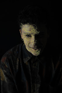
In this shoot I explored Dryden Goodwin's technique of etching into his photographs in further detail as well as developing his style in my work and my it original. First of all I shot in the studio which differs to his candid style and my photographs are much more stages and have a particular intention. I tried to incorporate certain lighting to contribute to the connotations as well as considering the colour of etching as well as the style. I included a very rash, messy technique in order to imply anger whereas i used a softer, more fluent use of line to imply happiness.  I used F11 and shutter speed of 1/125 as well as two soft boxes either side of the subject. In some cases I turned of one of the soft boxes in order to create shadows and darkness depending on the intention. I used the pen tool on Photoshop to create the etches into the face. I also explored the effect and dominance that phones have on people lives which shows a relation to Ronya Galka's work, therefore multiple artists styles as well as my own into one. 

I feel that this is one of my most effective photographs from the shoot due to the relevance of the facial expression, lighting, etching style and colour. I placed my subject in the centre of the frame, positioning his head slightly tilted down whilst style looking into the camera. This create a rather sinister/evil feel which was further through the shadows on the right side and background which was produced through turning the right soft box off as well as using a black background. Darkness has connotations of the unknown as well mystery and death. When coming to using the pen tool in Photoshop I decided to use red paint which relates to the facial expression and intention of creating a very evil sinister effect, as well as demonstrating a strong connection with the work of Dryden Goodwin. This works well with the messy style of etching that I used as it also implies anger.  I particularly like the effect of making the pupil of the eye red which contributes to the overall evil outcome. 

In this photograph I used a slightly different approach and attempted to introduce Ronya Galka's interest in phones and how they affect and dominate peoples lives. I attempted to convey this through the way the etching dominates the composition and even dominates and seems to be taking over the subject's face, being completely subdued in lines. I also developed Dryden's technique further by included etched text which contributed to the message. 'ADDICTION' relates to the way people in society are obsessed and fixated on technology and phones and I have attempted to portray it as a negative aspect of life. The white etches stand out very effectively from the rest of the composition and ends up as being the focal point of the pieces, enhancing the intended effect. The use of lines also illustrates the shape of the subjects head as does Dryden in his work. I like the way that the lines between the subjects face and phone seem as if the two are connected, almost acting as an umbilical cord which also relates Drydens series 'Caul'

Thursday, 21 April 2016

Shoot 9 - Straight Images


Shoot 9 - Contact Sheet


Connecting Essay


This photograph is taken by Dryden Goodwin, who is one of my researched photographers, at night of a man who appears on a bus. It is part of a series named 'Caul' which is also the name given to a portion of the amniotic sac that can be left over a child's face at birth. In some cultures the Caul is given demonic associations, but in contrast to this it is also considered as the child being safeguarded or even gifted with special powers. Goodwin embraces motivation of a Caul and the red lines cover the subjects' faces like blood vessels or raw tissue which resemble the appearance and texture of a Caul. The colour of the lines being red can imply connotations of evil and danger which can relate to the association given to a Caul in some cultures. The subject appear to be specifically stern and intense through his pose which collaborates effectively with the use of the red lines. Dryden included these lines during the post-production stage where he etches into his own printed photograph

My intentions here were to show the influence and relation to Dryden Goodwin's work through the style of photography used. Similarly to Goodwin, I photographed as stranger whilst going on a journey on a bus. Despite the fact that I have photographed a stranger I have still managed to gain a sense of intimacy and relation through zooming in close to the subject, seeming closer than I actually am. I like the vibrance of the frame of the bus window and also insured that it was straight through rotating and using the ruler tool and arbitrary rotation. I like the texture of the scratches on the window which imply a sense of vandalism. I feel that the scratched in the window can relate to the way that Dryden Goodwin etches into his photographs in post-production. The vibrance of the red relates to Dryden's etches and also pieces if his art where he paints in red watercolours. The compositions is also effective and I like the way that the frame of the window acts as a border for the image. There is a contrast between the saturated reds of the bus with the bleak colours inside the bus. I insured that the photograph was taken at a low angle looking up at the subject which provides the subject with a sense of power and status.


These two images can connected through the fact that they're both focussing on people who are on transport. Also red lines have been added to the subjects face and show resemblance with blood vessels. However the way that the lines have been added are different. Dryden etches into his photographs whereas I included the lines by using photoshop and using the pen tool. The red lines have different effects in the  separate photographs. In Drydens photograph the line add a evil feel to the piece which accompanies the dark colour scheme whereas my image contributes to the bright photo and relates to the red colour of the bus. The photographs have also been taken at different times which has an effect on the outcome.